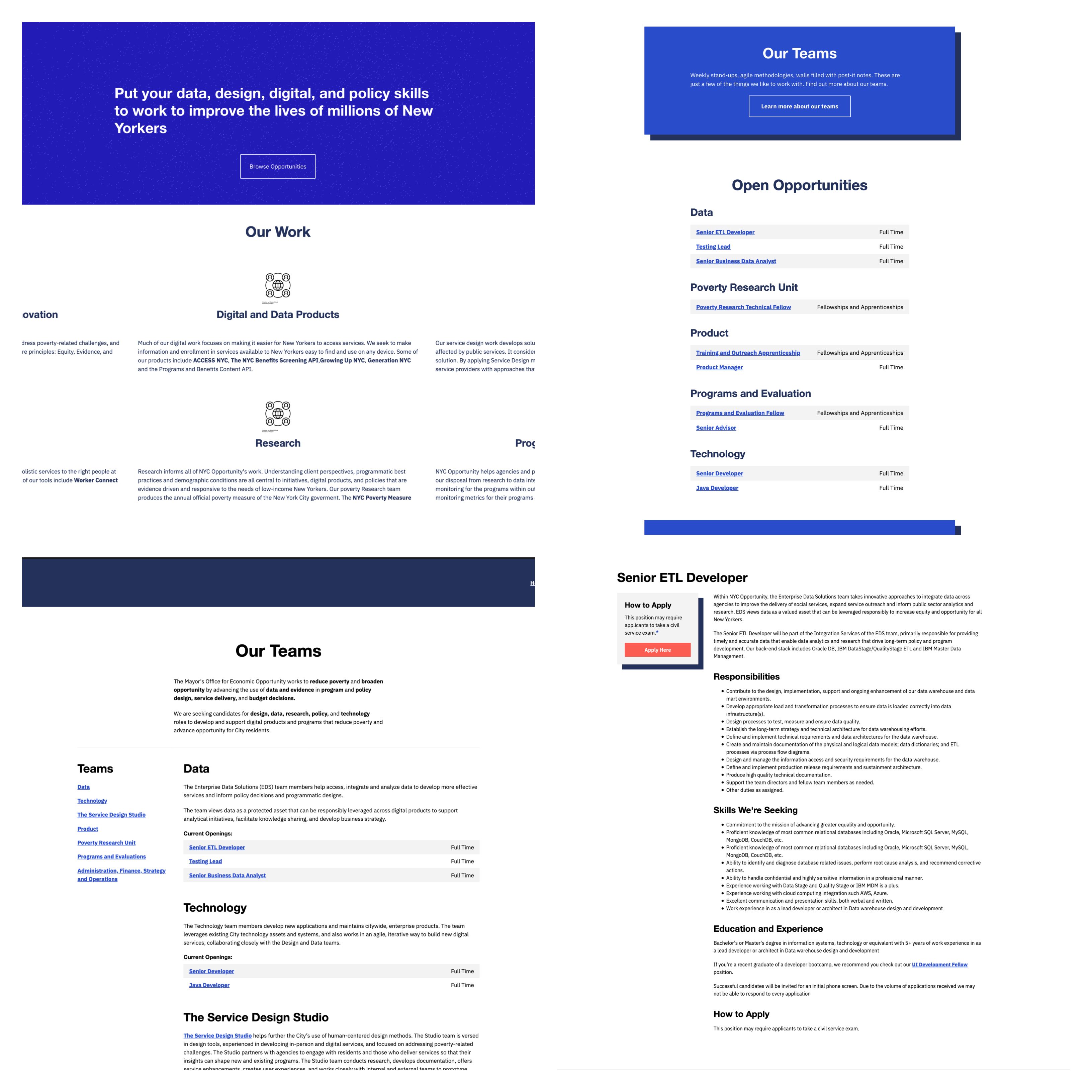
Redesigning a goverment job site using Vue.JS & Publii CMS
As a developer at NYC Opportunity, I started working on a project focused on redesigning the recruitment workflow for our team. Currently, our team’s job site uses Bootstrap 2 and TeamSite, a CMS which is pretty painful to work with. Uploading positions to our team’s job site or navigating the website to learn more about NYC Opportunity was not the greatest user experience. Thus, we needed to solve both problems, rethinking how to advertise our organization’s teams, job positions and how to be able to manage to upload, edit and update information.
One of the issues on the home page that affects the design is the long text sections. The homepage should provide a quick 10 second readable statements that engage the user. The long text paragraphs not only affect the ordering of other elements on the page but creates noise which affects the main goal of getting visitors to the site excited about the organization’s mission.
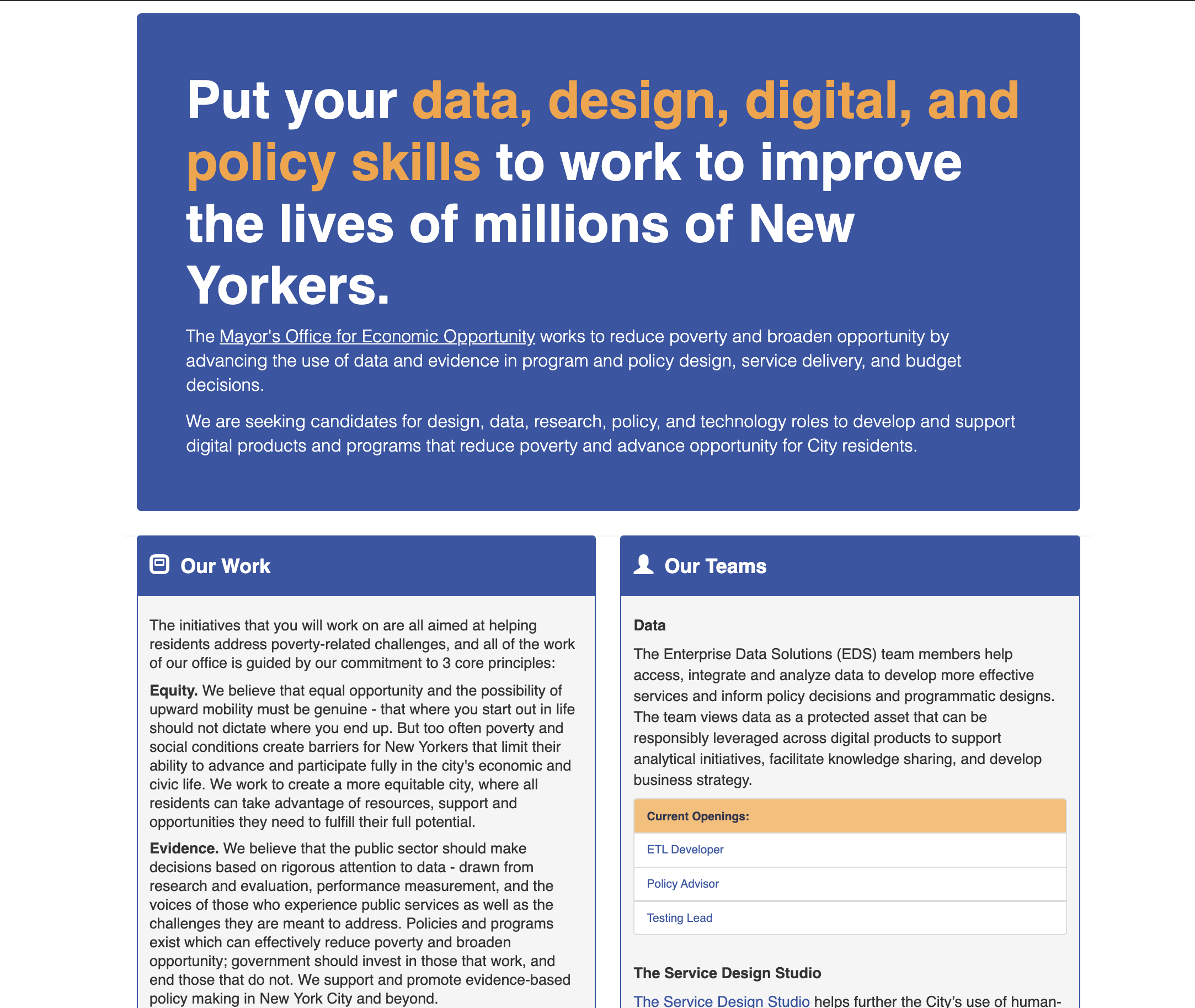
We created a website removing long text sections from the homepage. Adding a 2 x 3 grid section to display the different expertise within our team with an average of 3 sentence description of each expertise. Also, displaying the jobs available within our team on the homepage. Publii CMS, which is built with JavaScript uses Handlebars.js. This was a bit painful trying to filter jobs based on tags but Vue.js was the perfect solution to overcome this.
Creating a Vue app was easy and the documentation for Vue.js is great. It was as easy as dropping a script tag and creating the Vue app to be used. I ended up creating a computed and method properties, these functions I used to filter the correct job post for each team. We also used NYCO Patterns for the styles and UI components of the site. Here is a sneak peak of what the new site will look like.